Colours and fonts: how to choose them for your business website
Colours and fonts say a lot about your business before anyone reads a word. How to choose them so they reflect who you are and stay readable on a phone.
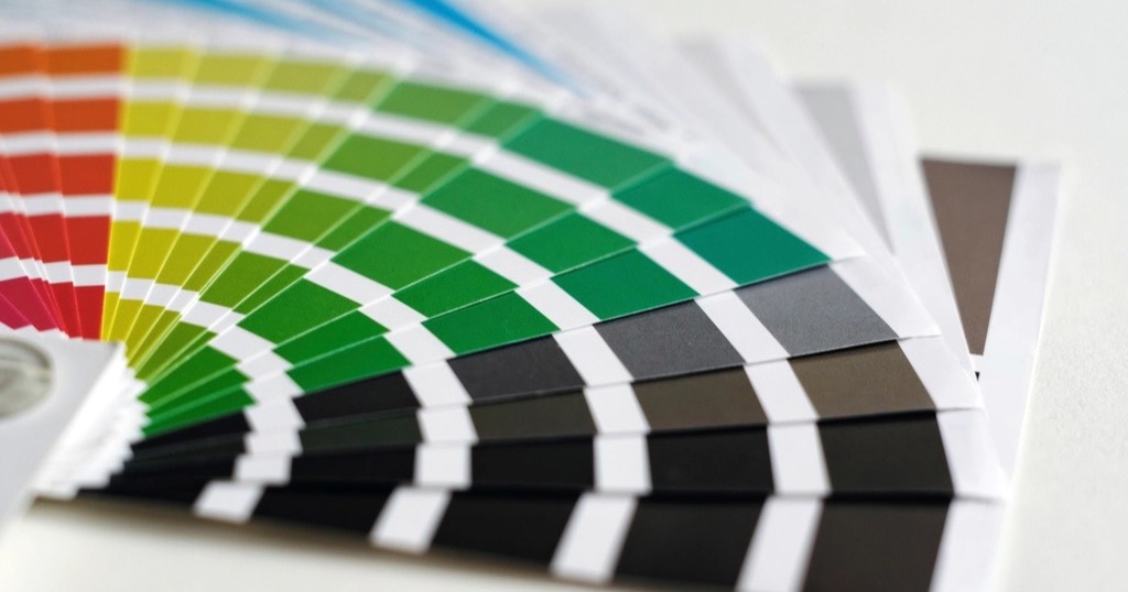
A dental clinic in black and gold says something very different from one in whites and soft blues. Similarly, a bakery with a typewriter font does not feel the same as one with a round, cheerful typeface. Before reading anything, visitors have already formed an idea of you from the colours and fonts.
Colours and fonts: start with what you already have
If you have a logo, a shop sign or business cards, the website should follow the same line. Customers who know you from the street should recognise your business when they visit. No need to copy every detail, but keep the colour family and the tone.
If you have nothing yet, this is a good moment to decide, and it will serve for your social media and printed material too.
Colours
Few, each with a clear job
- One main colour, the one that identifies you. For example, put it on buttons and whatever you want to stand out.
- One or two supporting colours, for backgrounds, sections or details.
- Neutrals: whites, greys or creams for the background, and a dark shade for text.
In short, more colours do not make a website more cheerful: they make it more confusing.
What they suggest
There are no fixed rules, but there are common associations:
- Soft blues and greens: calm, health, trust. Common in clinics and therapy.
- Earthy, warm tones: approachability, craft, nature.
- Black with one bright colour: character, modernity.
- Pastels: softness, childhood, beauty.
What matters is that it suits you and your customers, not following a trend.
Make it readable
Text has to contrast with the background. Light grey on white looks elegant on the designer's screen and is unreadable on a phone in the sun. There are free contrast checkers; more in web accessibility.
Fonts
Two at most
- One for headings, which can have more personality.
- One for body text, which has to be very readable at small sizes.
Sometimes a single family, in different weights, covers everything.
What to look for
- Readable on mobile: open letterforms, generous size (at least 16 pixels for body text) and airy line spacing.
- Proper accents if you work in several languages. Unfortunately, some trendy fonts lack them or draw them badly.
- In keeping with your business: a script font can work for a florist's heading, not for a law firm.
- Lightweight: every font is a file to download. Better still, use a few, served from your own website, which load faster and do not send your visitors' data to third parties.
Common mistakes with colours and fonts
- Five different colours on the buttons.
- Long text in capitals, or in a thin font over a photo.
- A decorative font in paragraphs.
- A beautiful design on desktop that cannot be read on a phone.
How I choose colours and fonts for each website
Nueva Página websites are designed from scratch for each business: we start from your logo and how you want to be seen, and I choose a short palette and fonts that read well on any screen. You can see how others turned out in work.
How to test colours and fonts before deciding
There is no need to guess. Try the combination on a phone, in sunlight and with low brightness, which is how many people will see it. Also write a real paragraph from your website rather than filler text: that way you can tell whether the font is comfortable in long sentences.
For contrast, the WebAIM contrast checker tells you straight away whether text reads well on its background. It also has a guide to readable typefaces that sums up what works on screen. Finally, show the test to two or three clients and ask what it says to them. If their answers match how you want to be seen, you are on the right track.
On a related note, you may also find what a home page needs useful.
Frequently asked questions
Do I need a logo before the website?
It helps, but it is not essential. You can start with your name well set in type and add a logo later.
Can I use my franchise's or professional body's colours?
If you have brand guidelines, I follow them. If not, they are a starting point.
Is a dark background a bad idea?
No, if the contrast is good and it suits your business. Even so, for long texts, light backgrounds are usually less tiring.
Can I change the colours and fonts later?
Yes. On a well-built website they are defined in one place, so changing them does not mean redoing the design.
Are colours and fonts part of the design?
Yes. At Nueva Página each design is made for the business, starting from its logo. See examples in work and prices in the cost calculator.